BRANDING
Project Details
ORIGINSIX as a specialty coffee beans producer wants to satisfy the need of coffee lovers who always crave for the best coffee quality, especially those in middle and upper class. All of ORIGINSIX coffee beans are handled by their own team from start to finish, ensuring their product quality always at its best. ORIGINSIX wants to become the icon of modern coffee while keeping their integrity and characteristics.
Results
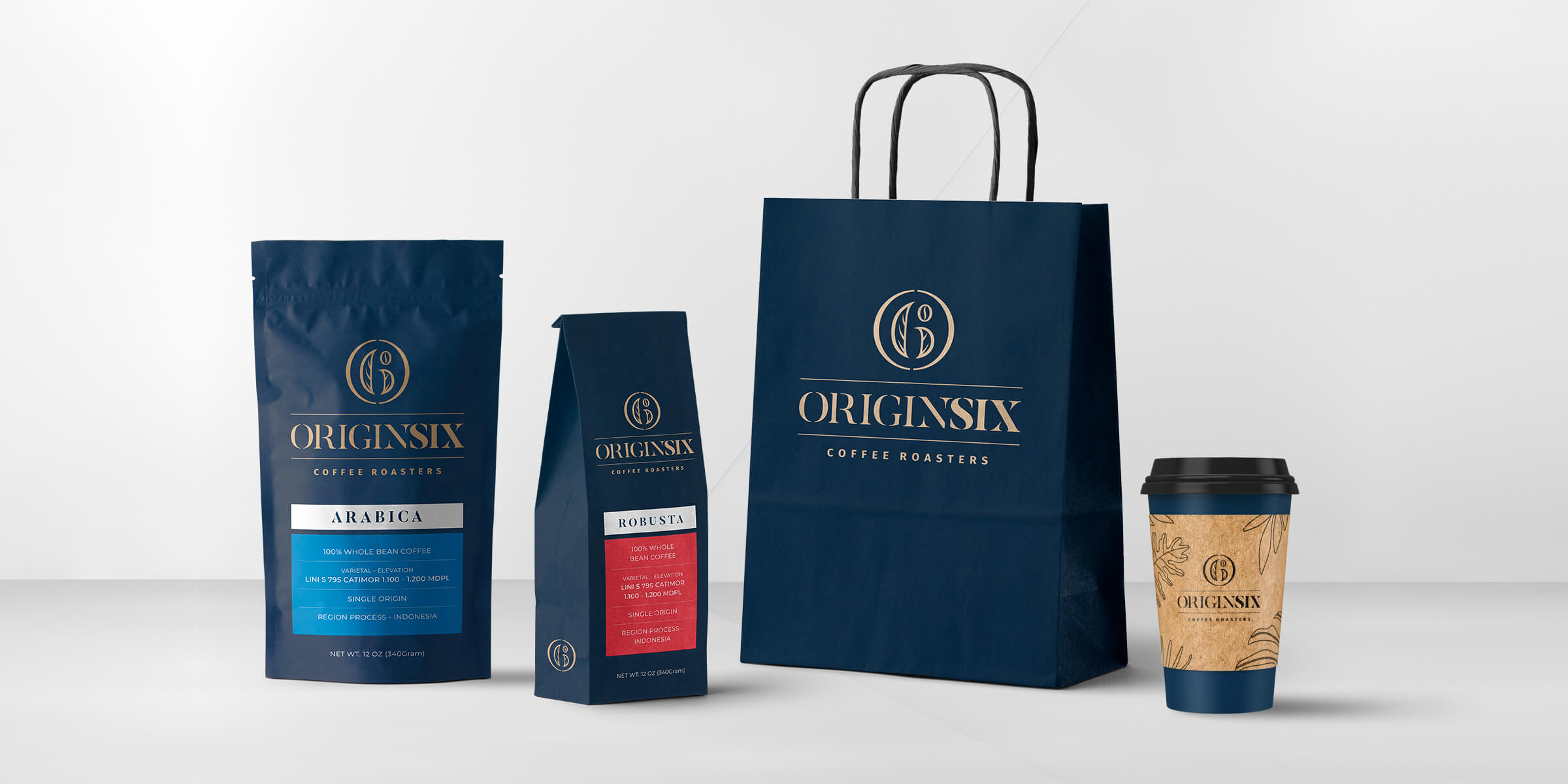
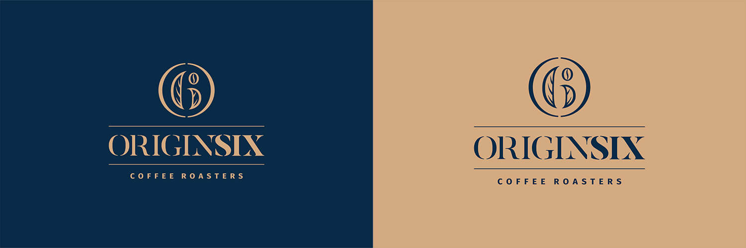
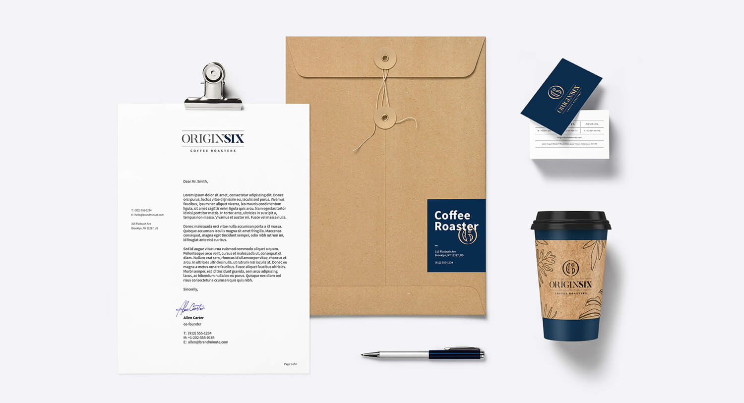
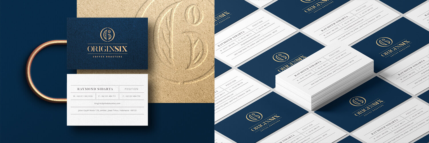
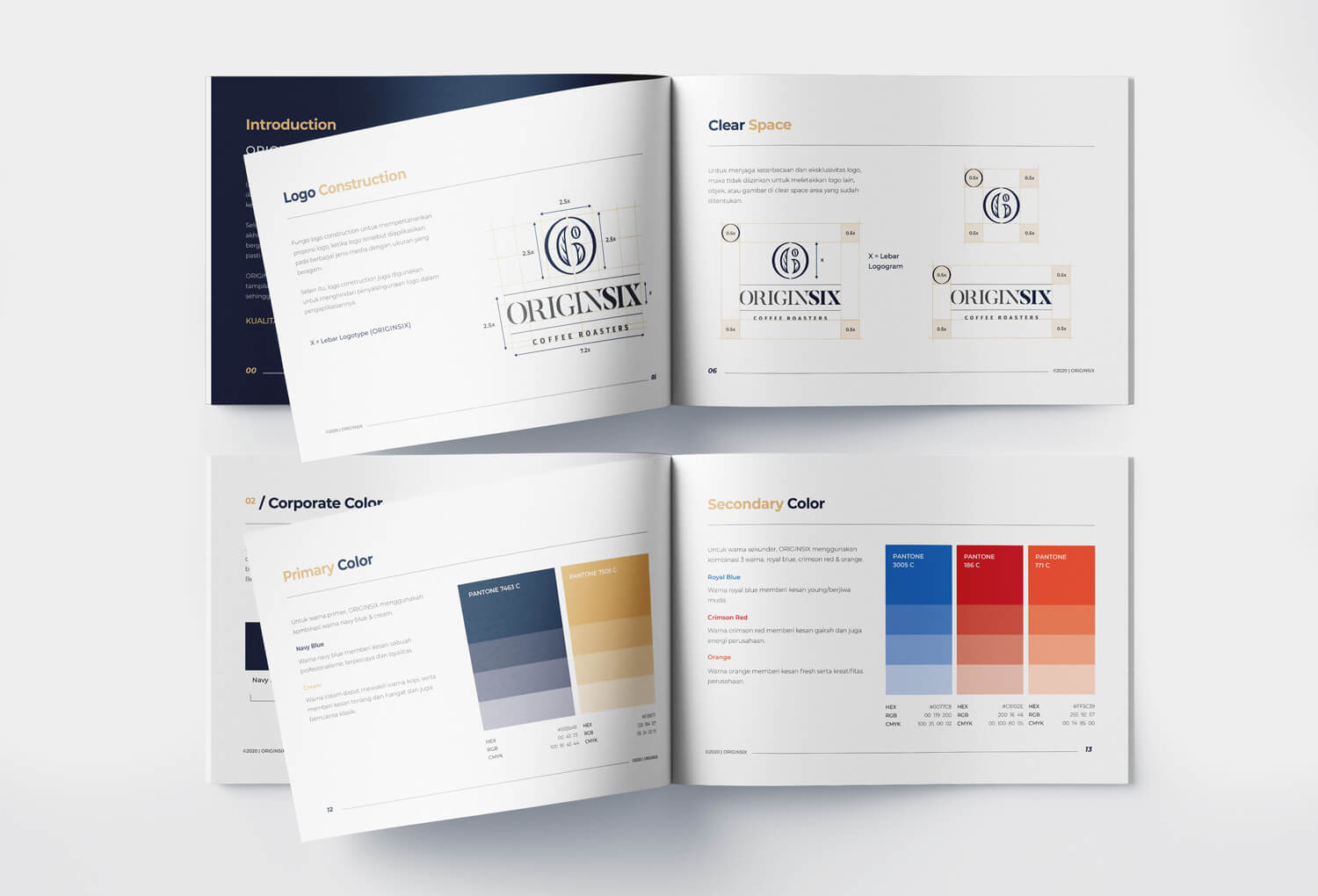
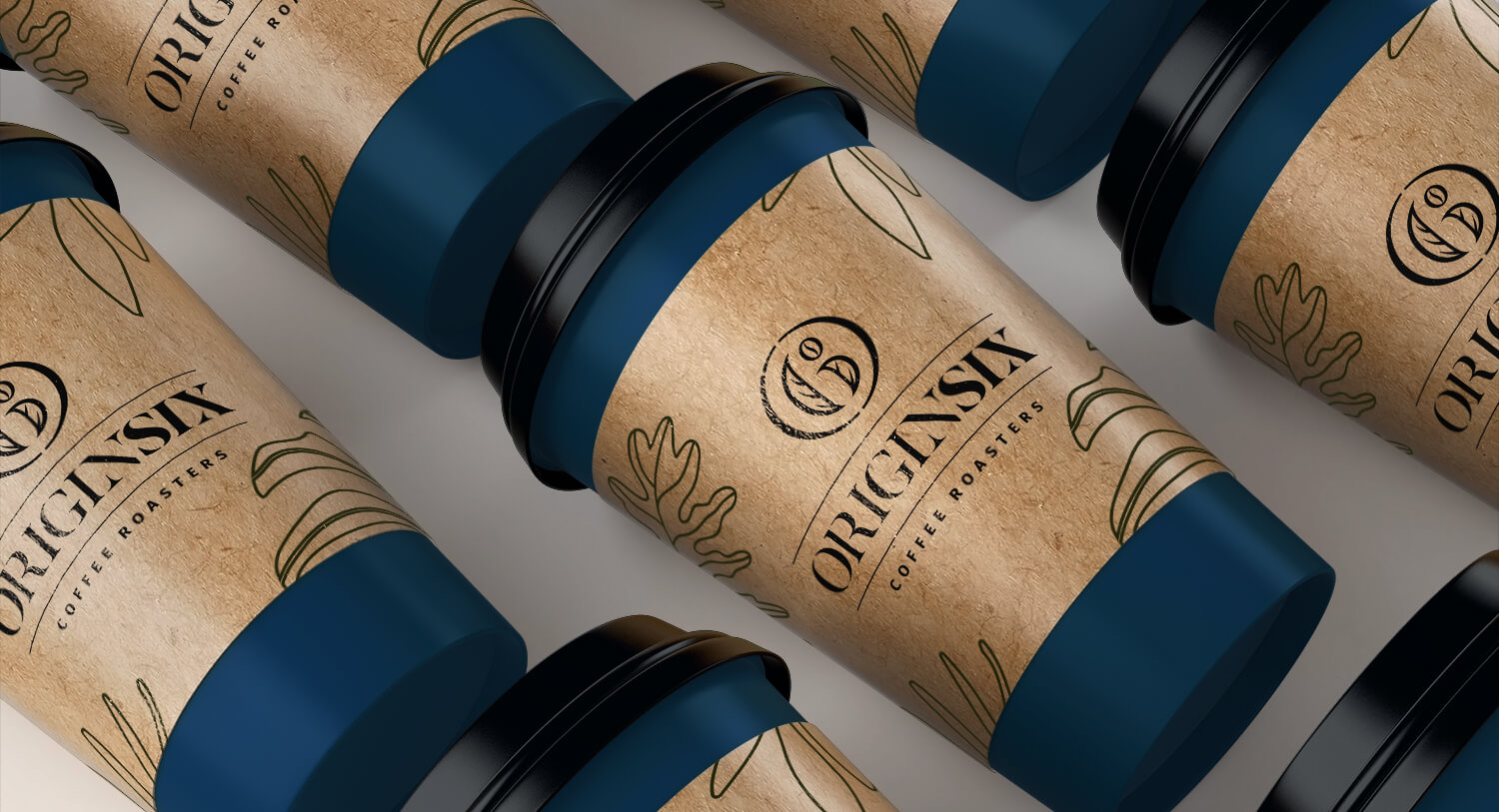
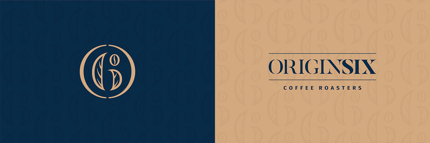
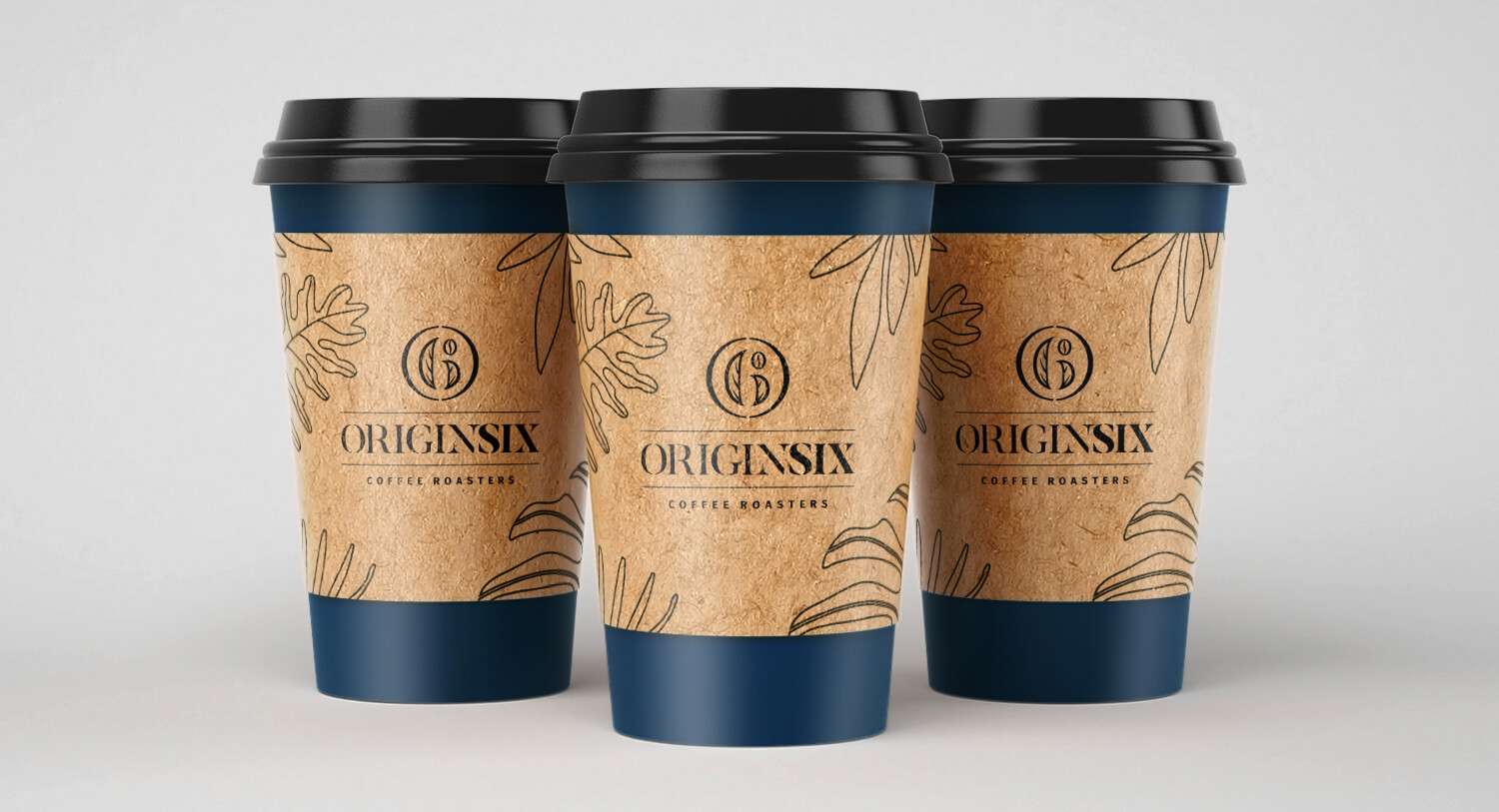
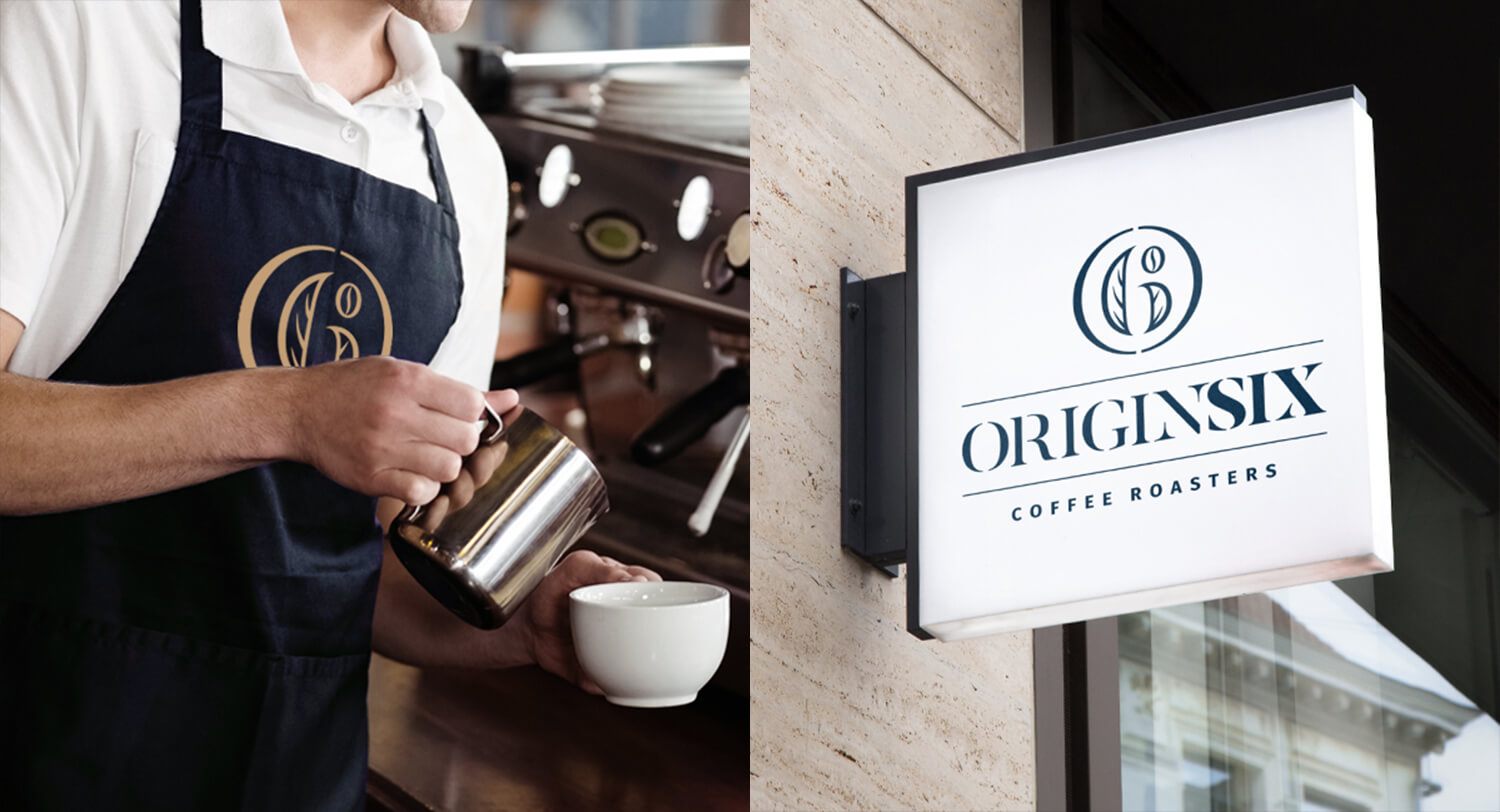
Logogram is made with a curved shape symbolyzing integrity. The number 6 is made from coffee bean and leaf which means the unity of the team. Thick and thin lines in ORIGINSIX’s logotype gives a classic appearance with modern touch. Navy blue was chosen to give an impression of professionalism, trust and loyalty. While the cream color represents coffee and gives an impression of calmness, warmness and classic nuances.
Project Type
Branding Identity
Year
2020
Location
Surabaya, Indonesia
Objective
Branding a specialty coffee bean producer with classic look with a modern twist.

Address
Jl. Taman Internasional B8 no. 33A, Citraland
Surabaya, Indonesia
Telephone
031-745 1133
COMPANY
__________________________
BRANDING & DESIGN
__________________________
COPYRIGHT © 2019-2026 Gradin Studio. All Rights Reserved. Please send bug report and feedback to: Gradin Digital Agency
