Gradin Studio Visual Identity & Logo Guidelines.
Preface
Every journey starts with a guideline
This Graphic Standard Manual is about more than just the logo. It’s about a visual system made up of many parts that work together to elicit a feeling, and convey what Gradin Studio is all about.
We are professional, creative, forward-thinking, modern and technology based.
These guidelines are designed to help anyone working with the Gradin Studio brand in a visual context. They allow everyone to work with confidence and consistency in a variety of formats, areas and circumstances. If you have any questions about our brand principles, please contact us.
Introduction
Gradin is Your One Stop Creative Solutions.

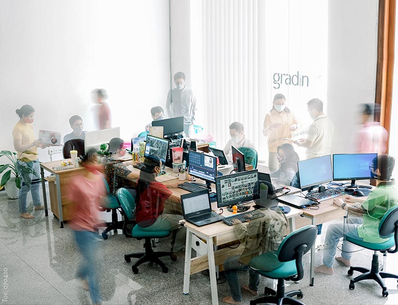
We are a digital agency based in Surabaya who believes creativity and technology are now inseparable. With our expertise in visual branding combined with extensive knowledge about the web, we would like to help you navigate this digital age to grow to your true potential.
We began our journey in 2010, and then established ourselves with the name GRADIN in 2014. We’ve worked with clients from various fields such as industry, food, fashion, etc. Our diversity in clients’ backgrounds and services give us fresh perspective when faced with new challenges.
We value our relationship with you – our clients. Your growth as a brand reflects our team’s growth, and vice versa. We believe your growth and ours are inseparable.
Corporate Typeface
03
Our core brand typeface is Lato. We use different weights to communicate different parts of our identity principles. Light/regular feels functional for body copy, Bold feels to the point and modern, while Black feels strong. Black should be used sparingly — let’s not be too shouty.

Address
Jl. Taman Internasional B8 no. 33A, Citraland
Surabaya, Indonesia
Telephone
031-745 1133
COMPANY
__________________________
BRANDING & DESIGN
__________________________
COPYRIGHT © 2019-2026 Gradin Studio. All Rights Reserved. Please send bug report and feedback to: Gradin Digital Agency
